
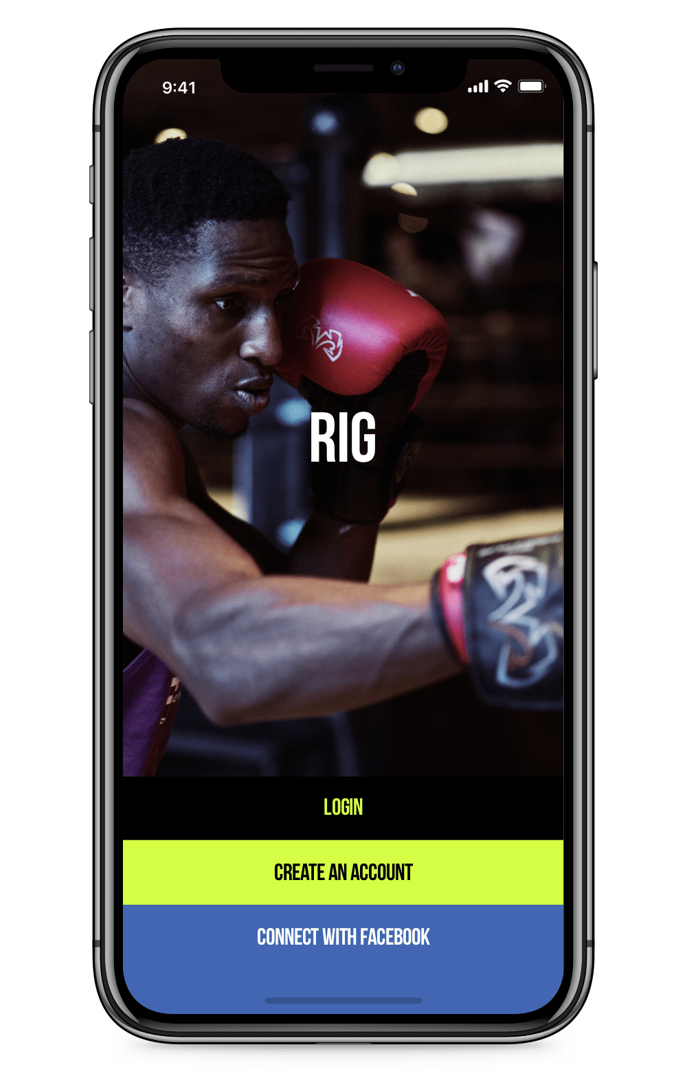
RIG
A complete redesign of a fitness app that helps you book one-off classes in London.
Services
User Research, Wireframing, Prototyping, UI Design
Type of Work
Mobile Application,
Web Dashboard Design
Year
2018
WHAT IS RIG?
Gym /dʒɪm/: A place, typically a private club, providing a range of facilities designed to improve and maintain physical fitness and health - says the Oxford Dictionary. True, but they forgot to mention the part you pay for a year and don't go there half of the year. Maybe you're the most dedicated person in the world, but you know what we're talking about.
Coming from this insight, RIG was created to help you book one-off fitness classes in London in 2017. Although the download numbers weren't bad, retention was low, and the users weren't engaging with the product. That was the reason why RIG contacted us, and we loved the challenge from the first moment.
USER RESEARCH & WIREFRAMING
The first thing was analysing their existing product step by step, starting from the App Store page to the end of each user journey scenario. We will mention each pain point and how we solved them below, but the main problem was including too many features in their MVP that depend on social user contribution, which made the app look abandoned for the first time user. To solve the issue, together with the founder and the investors of the app we created a new MVP scope and decided which features could be added when reaching a certain level of user growth.
When the scope was agreed, we started creating highly detailed wireframes for each screen so we could test and prove if our approach was right. After everyone was happy with the wireframes, we tested the prototype with gym managers, PTs and potential customers. The result was fascinating, and they already started to get the gyms onboard even before we started with the UI design.
DESIGN GUIDELINE
After making sure the wireframes work as expected, we offered a new colour palette and a design guideline. The existing branding was shaped around high-end gyms, and their choice of colour wasn't meeting the global accessibility standards, and it wouldn't work great with their purpose to include local gyms.
Our purpose was making the growth more possible both from the supply (gym) and user side, so the product had to look less expensive and but still reflect the dynamic and professional team behind the curtains. After working closely with the stakeholders, we narrowed down the colours and kicked-off a fresh beginning for the brand.

Bebas Neue
Sans Serif, Headings

SF Pro Text
Sans Serif, Body Text
To make things even more fun, we created an animated icon set to use across the app, including the navigation, loaders and more.
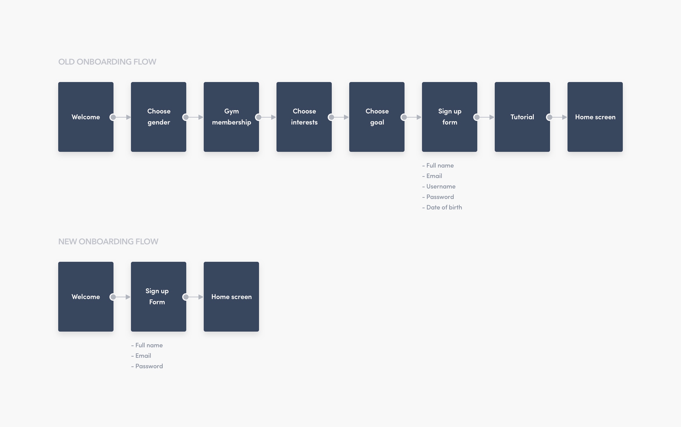
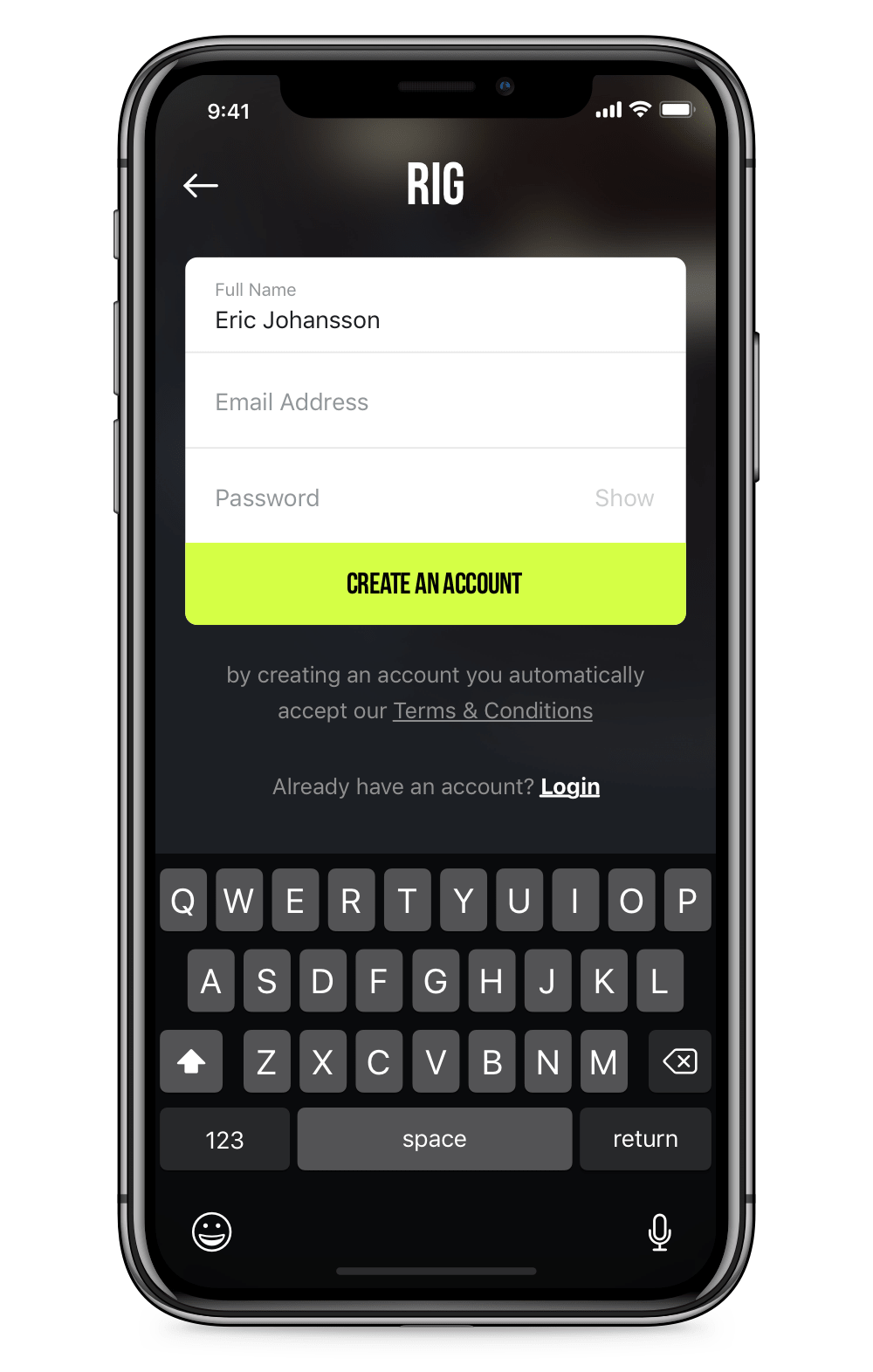
ONBOARDING
One of the main problems with the old version we spotted was the onboarding flow. The users had to go through 7 screens to reach the home screen, which required too much effort and type of information that could discourage them to fill in. Instead, we replaced it with a one-step flow with only three fields, which made the process a lot easier to complete. As expected, we succeeded to decrease the drop-off ratio from the first moment.
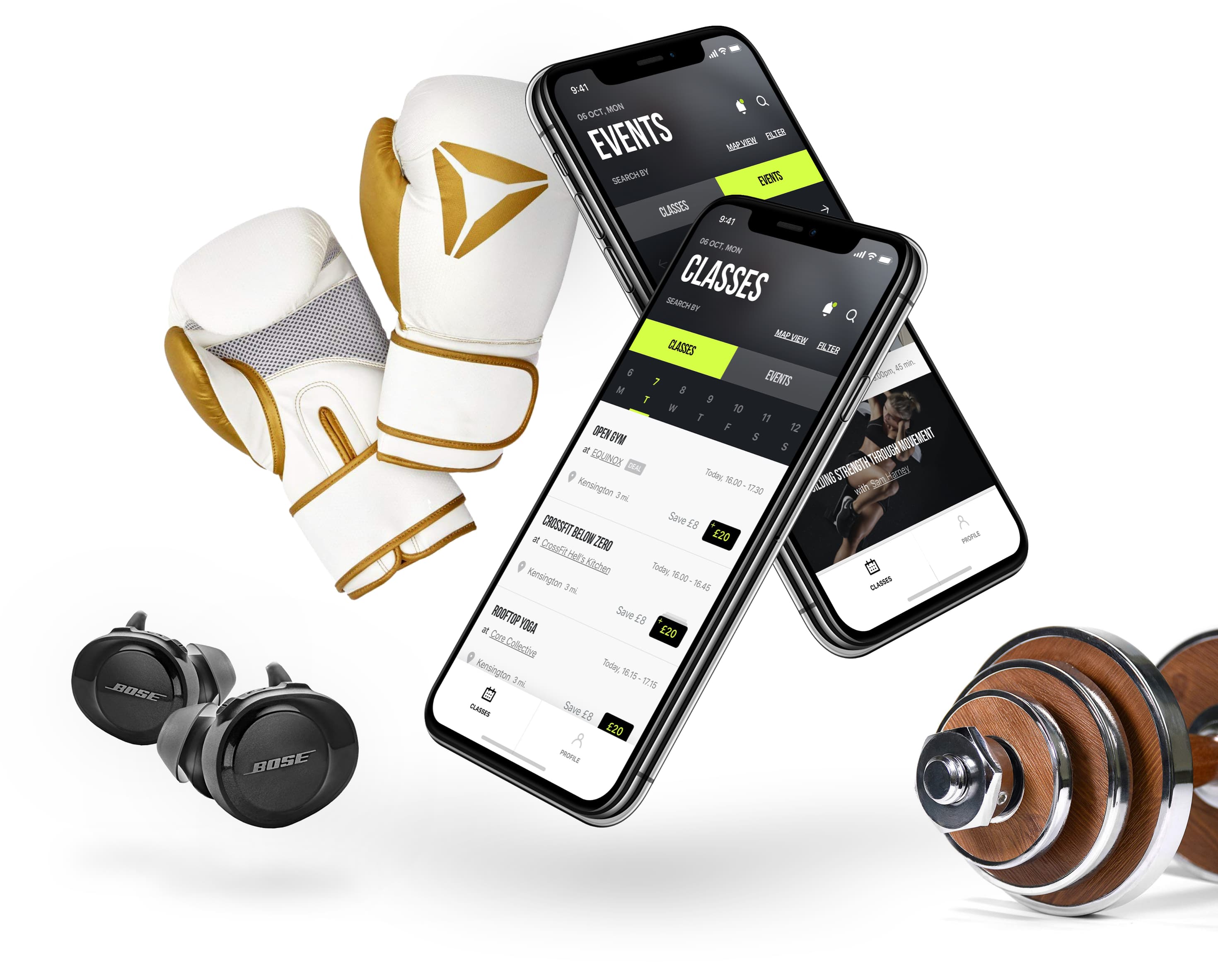
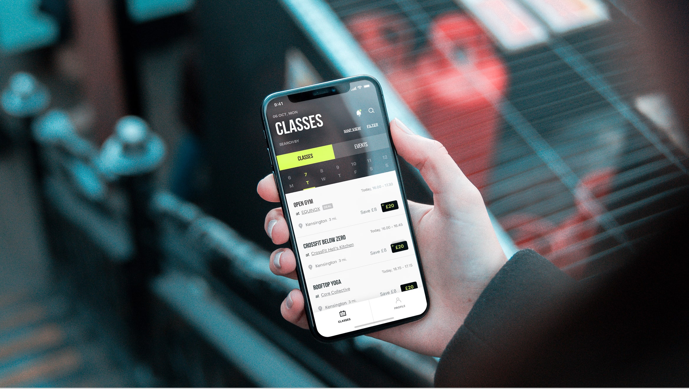
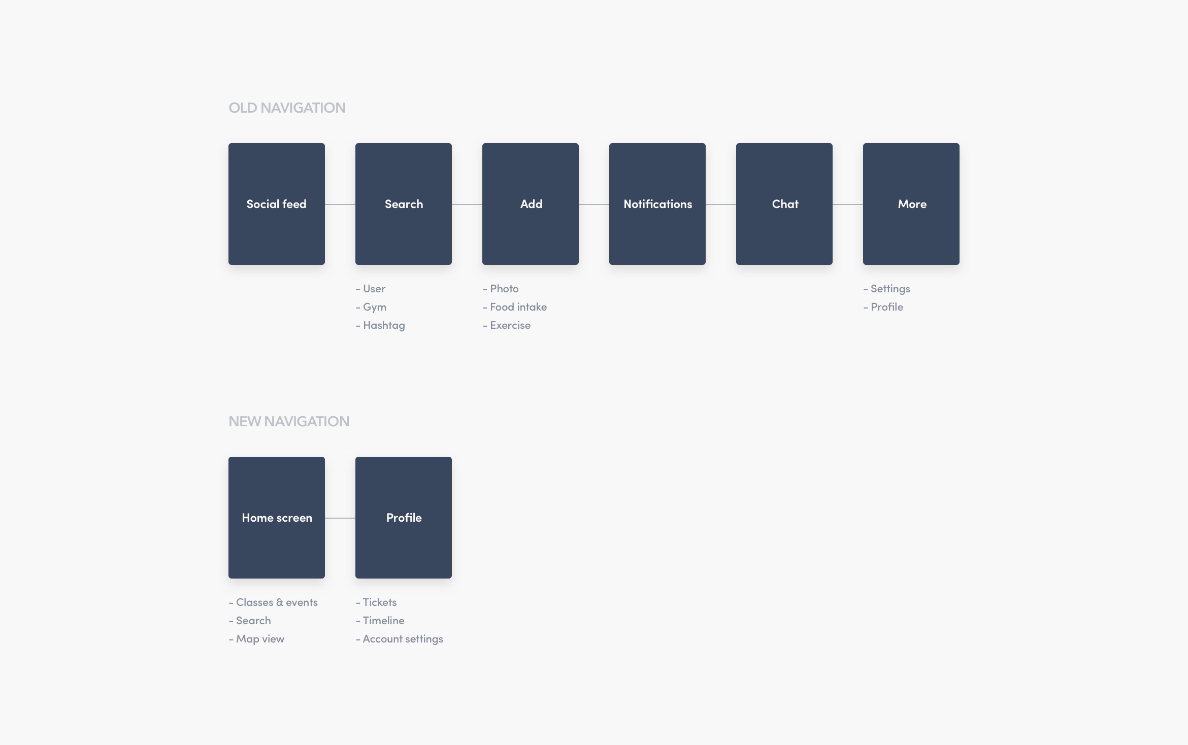
HOME SCREEN & CLASS DETAILS
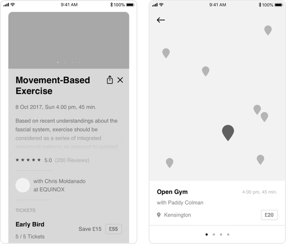
Here comes the most significant change in the user experience. When the user signed up and started using the app, the first thing they would see was a social feed, where the activity from the other users was listed; such as shared photos and check-ins to the nearby gyms, which made the app heavily depend on user contribution. It wasn't only causing people to face with a ghost screen, but it was also generating privacy concerns as your activity was visible by everyone using the app.
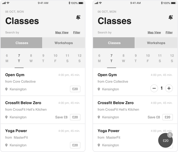
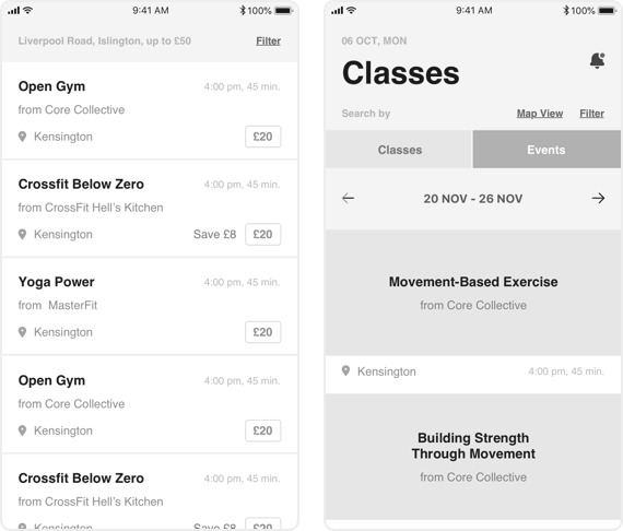
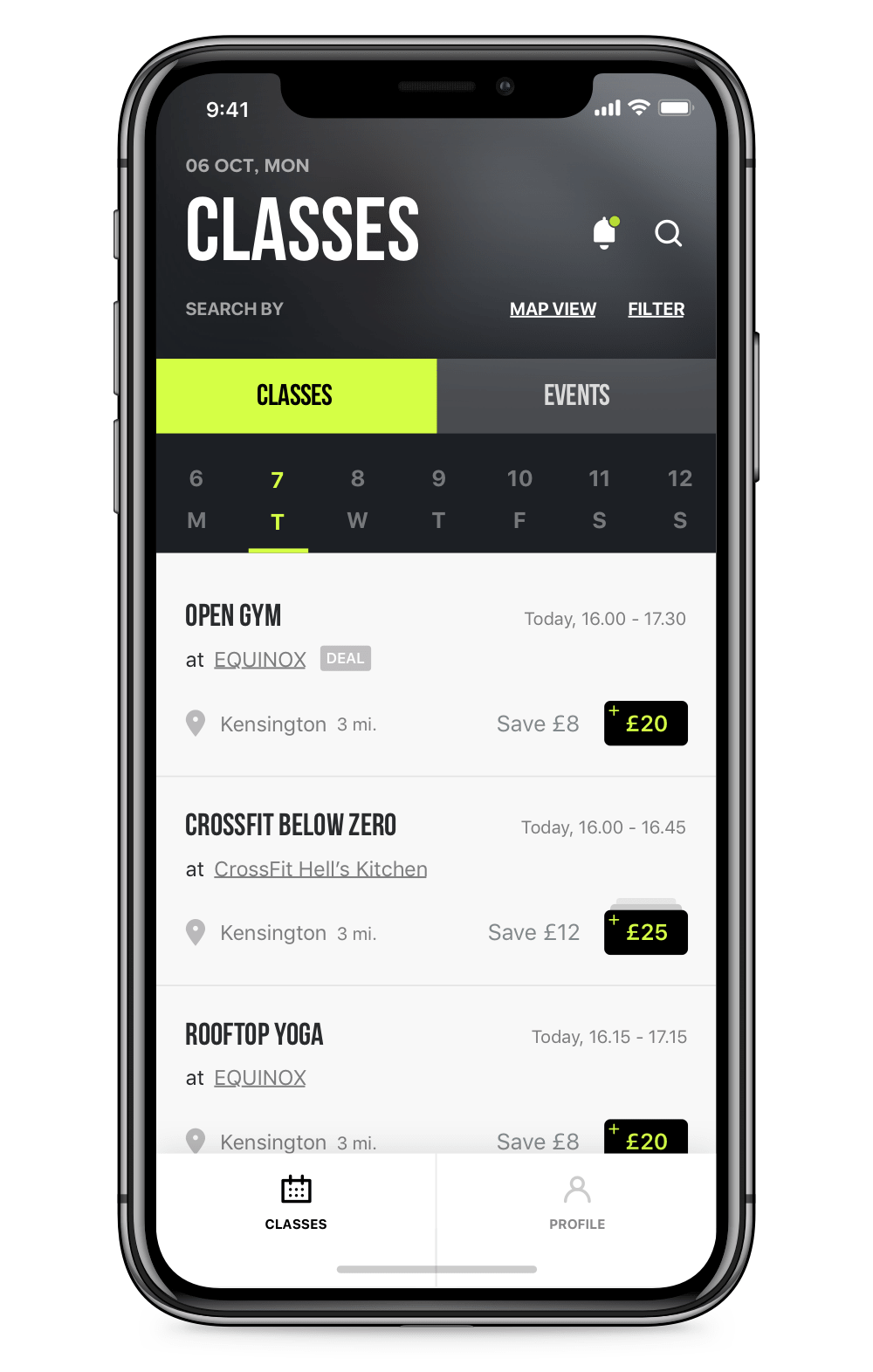
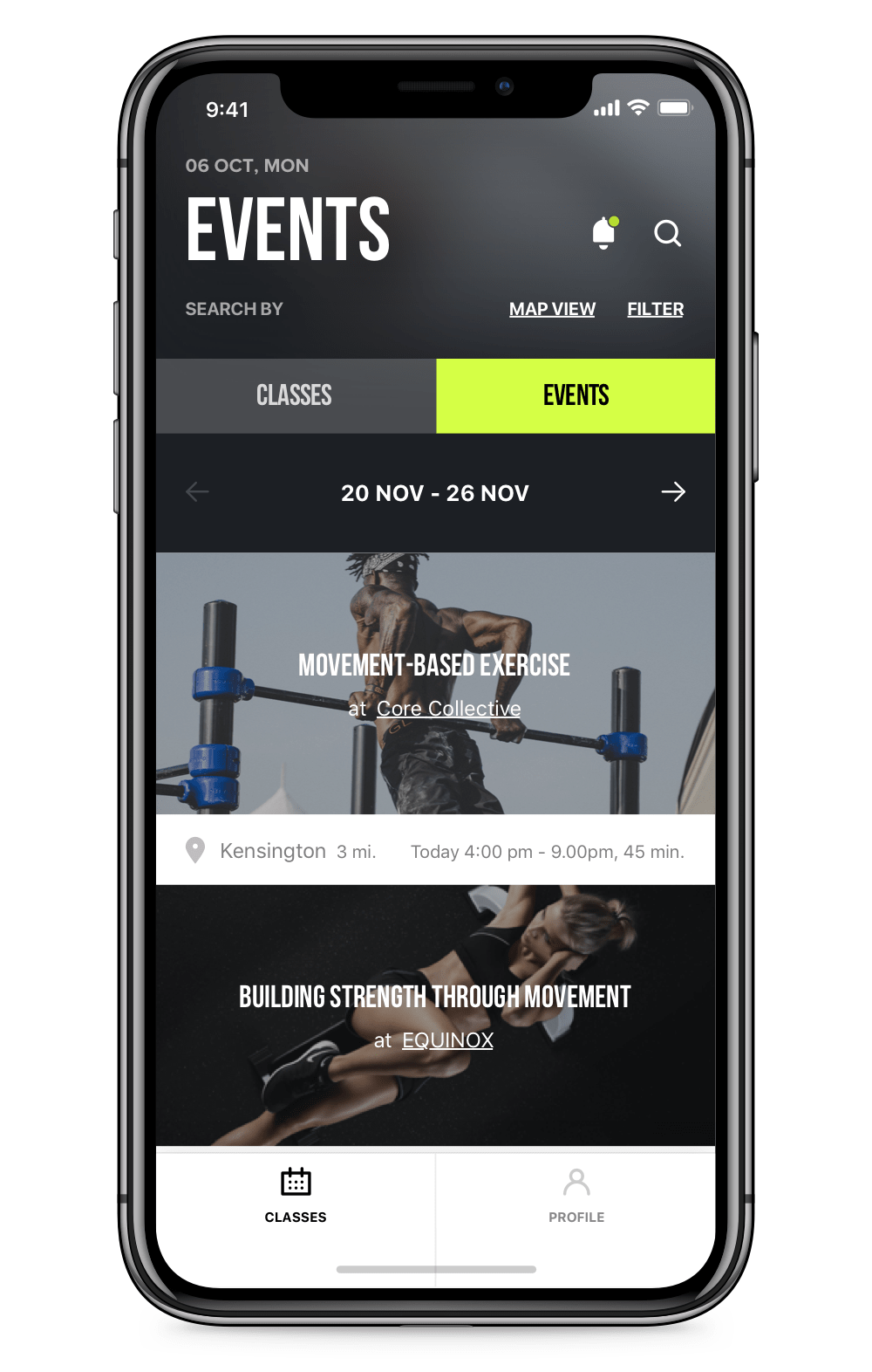
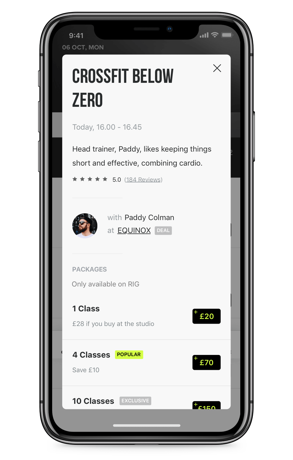
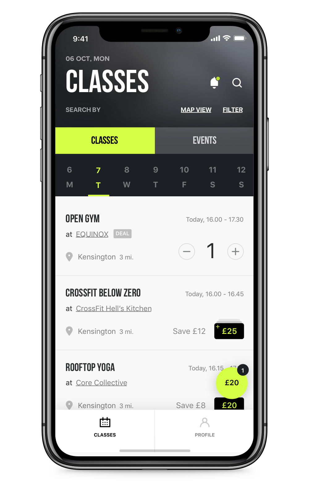
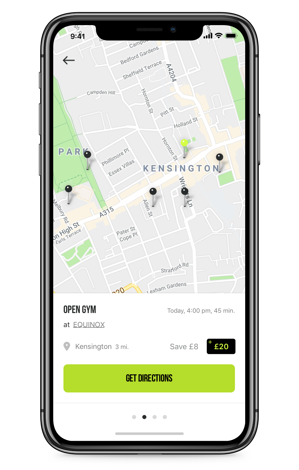
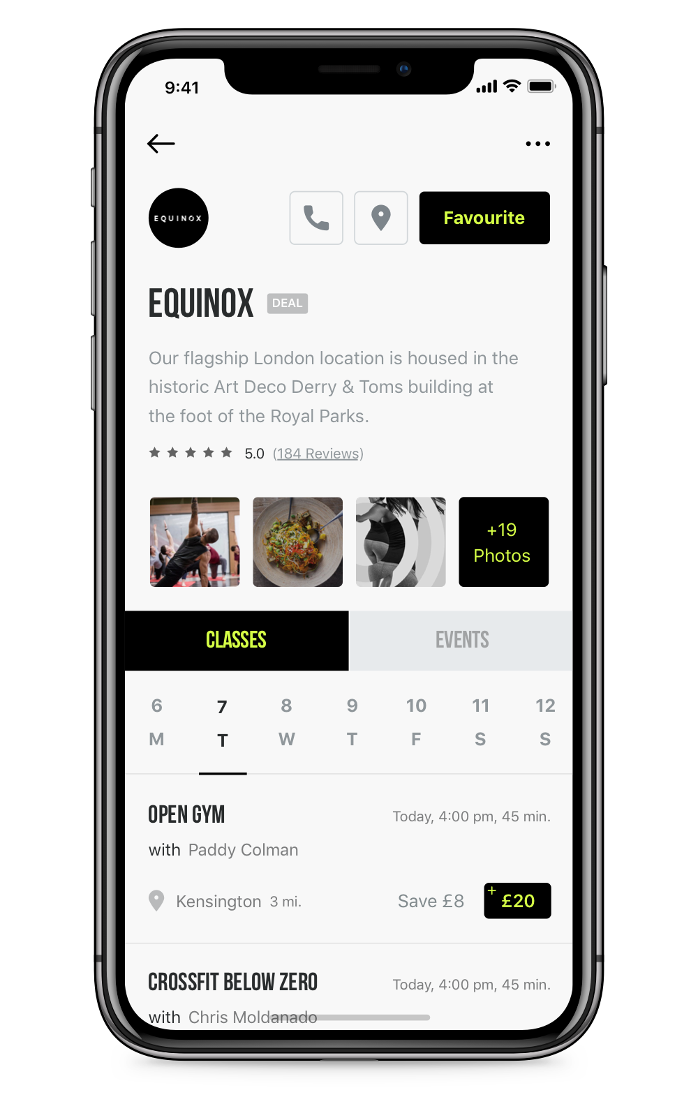
To solve the problem, we replaced the home screen with the actual content and placed classes and events happening in the city. From the first second, the users were able to find out the essential information, such as the location, the time and the price. To make it easier both for new and the returning users, we made it possible to learn more information or check-out with a single tap, which was loved by the users who tested the app.
One minor but useful touch was changing the date picker between the classes and events. The classes occur daily, and users would decide to buy them mostly the day before it happens, but it'd be hard to find an event happening every day, so we didn't want them to try every single day to find an event.
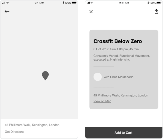
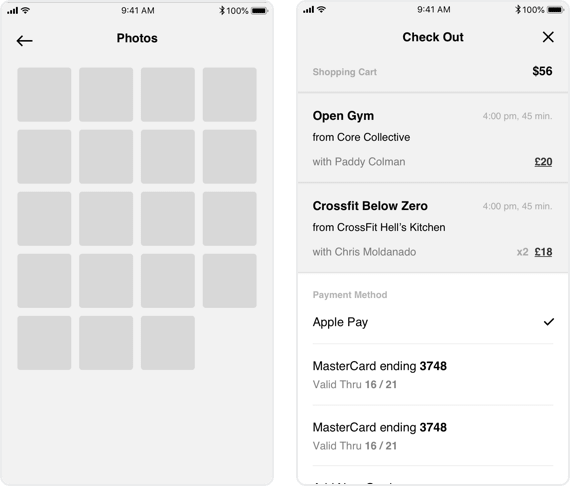
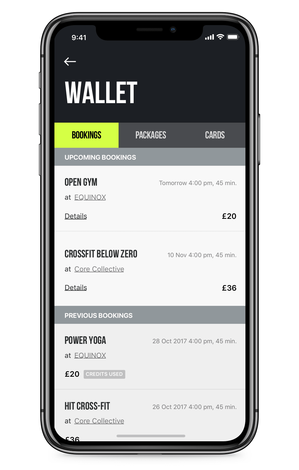
CHECKOUT
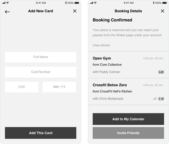
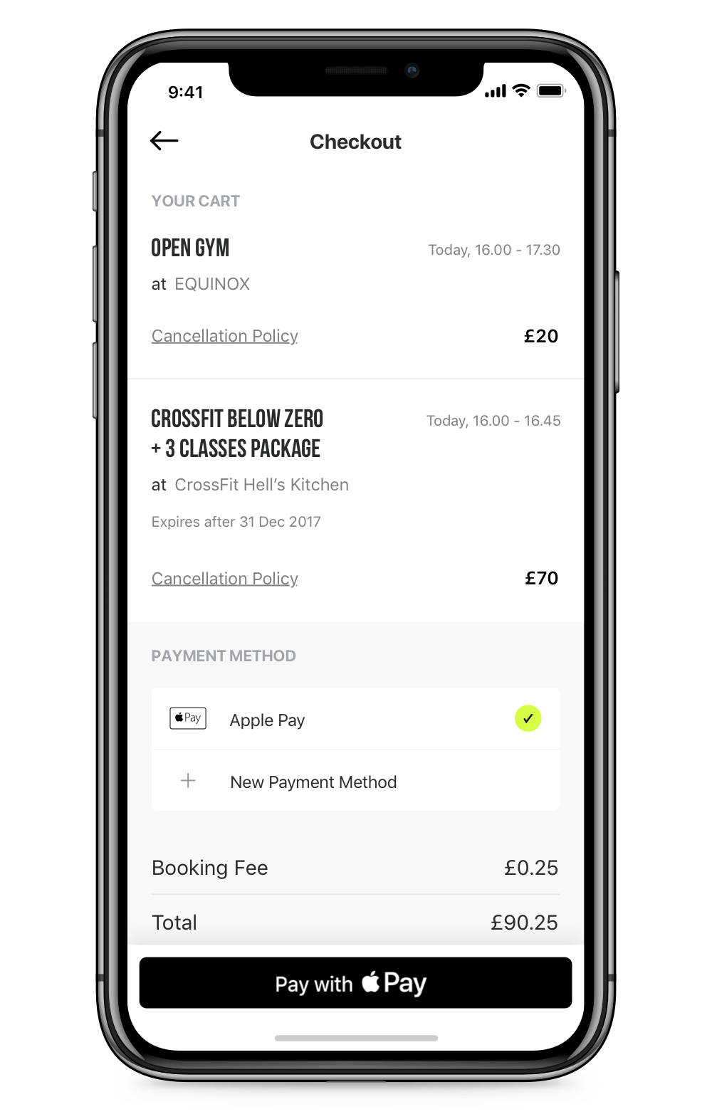
And the most important bit for a business to survive. Once a class or event was added into the cart, by simply tapping the cart button the user would see the checkout screen. We knew that one of the first questions users would ask on this screen was whether they would be able to get a refund in case of a cancellation. That's why we added the cancellation policy of each studio right under each ticket, so there would be no confusion. And because adding a new payment method is a pain, we set Apple Pay as the default payment method.
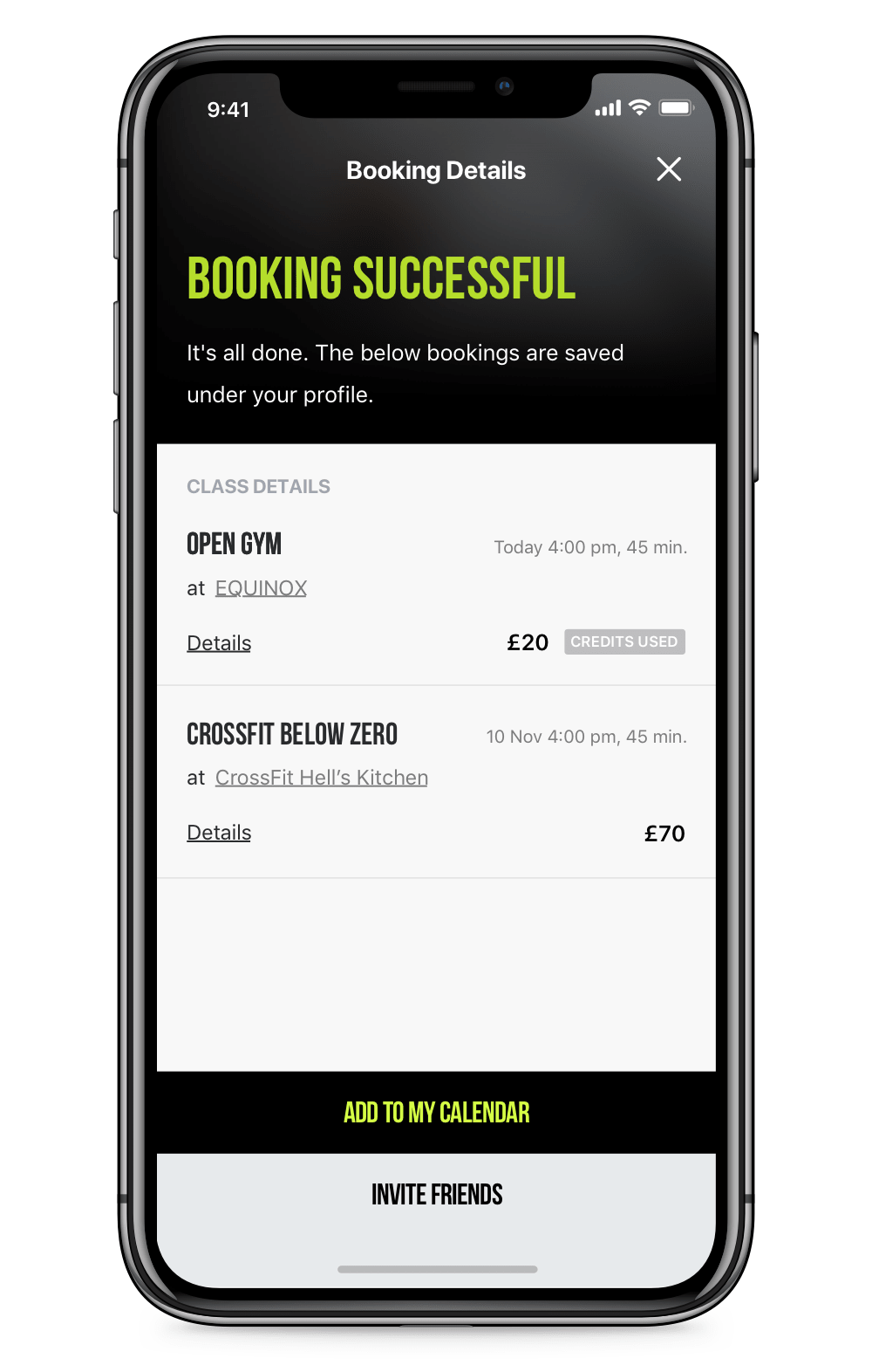
Some users could think whether they had to wait for a confirmation from the studio, so we made it quite clear on the post-check-out screen that everything is ready and they can already head to the gym. From this point, users can add their session to their calendar so they won't forget about it and also they can invite their friends, which would help the business grow.
So, here is a video demonstrating how a typical user would see the class details and checkout with only three taps.
BROWSING
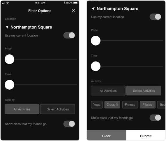
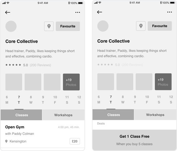
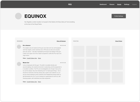
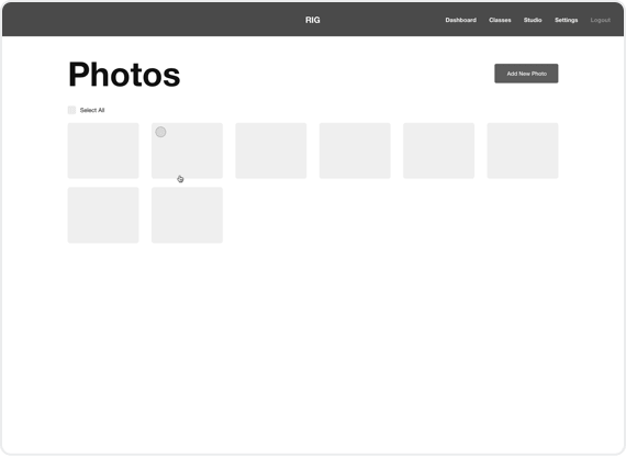
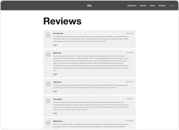
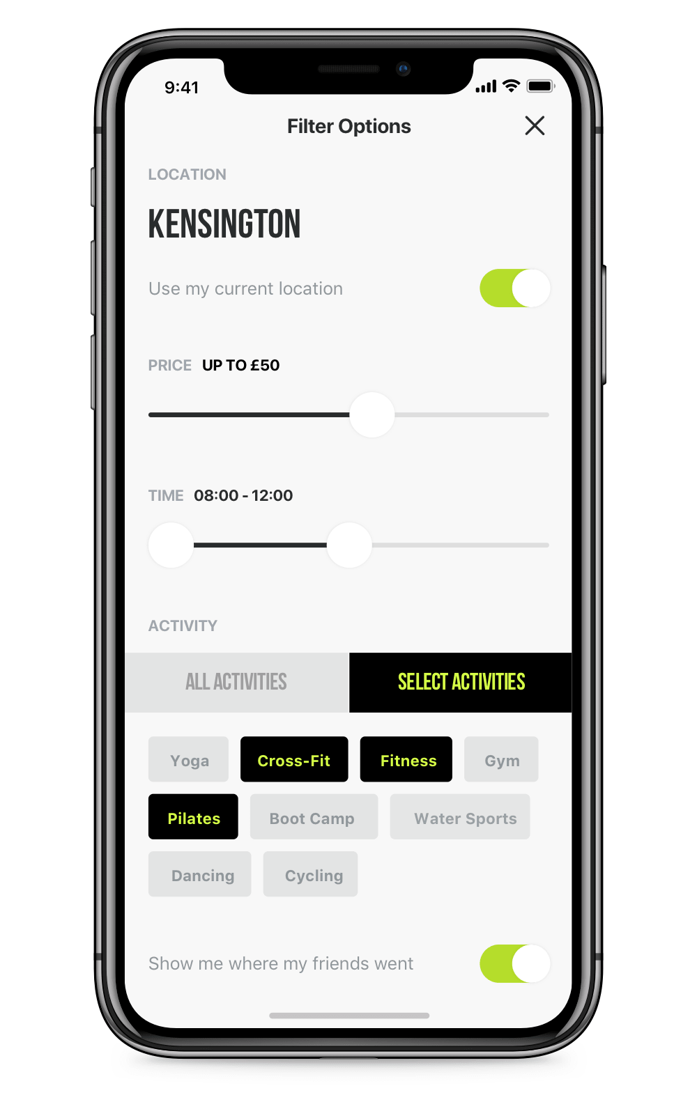
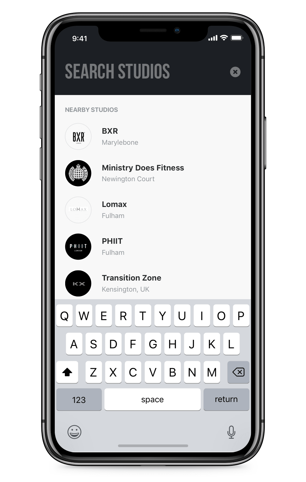
Apart from listing the classes, we also added the filter, search and map view tools right on the home screens so that users can customise the list to their needs, quickly see everything in a specific neighbourhood or directly search for their favourite studios. Also, if they would like to find more about any studio, they could check their profile with real user reviews and photos coming from Instagram.
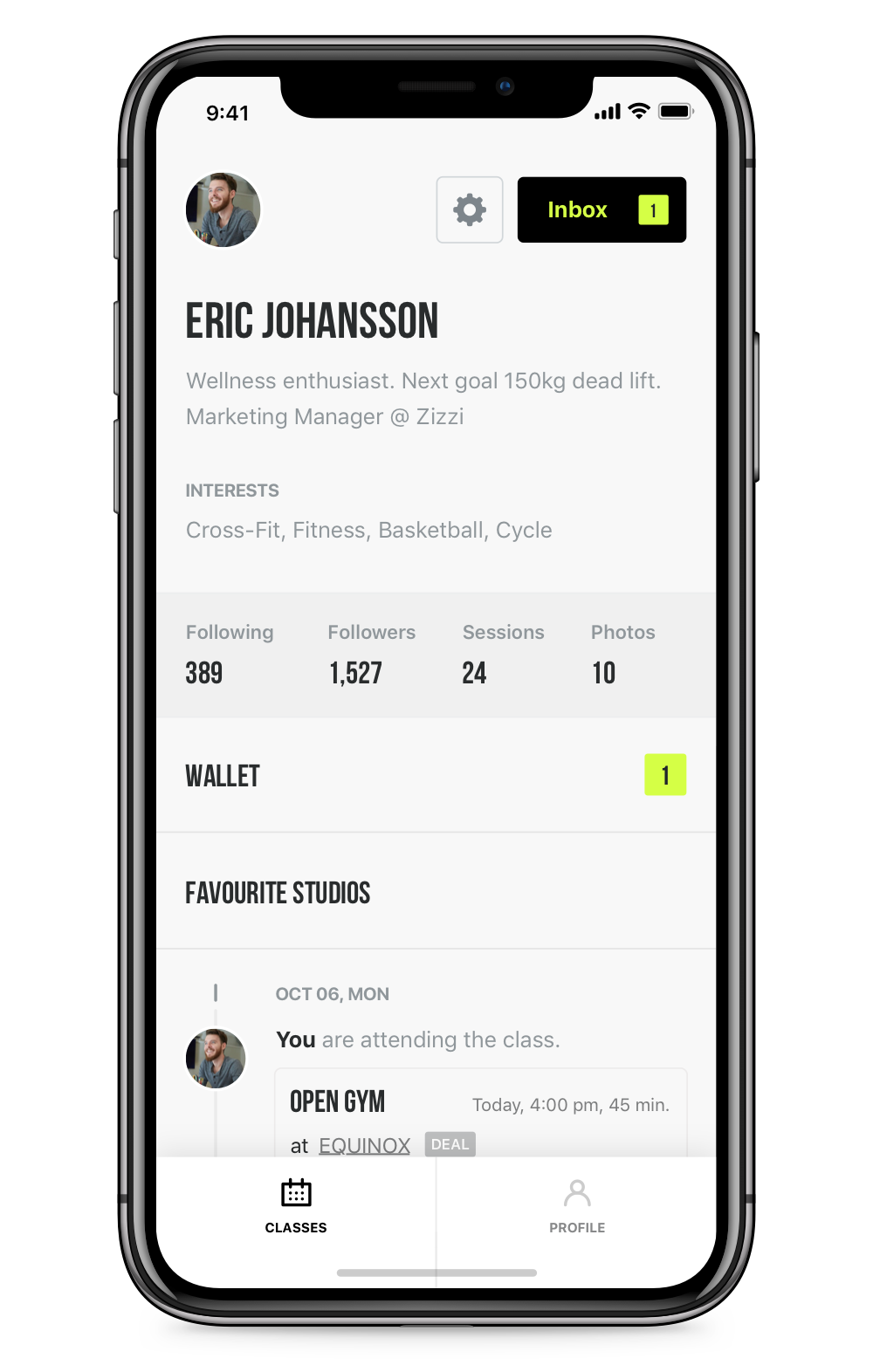
PROFILE
For the returning users, we designed the profile section in a way that they could easily access their tickets and favourite studios. We added stats section to give an insight on how they are doing and lastly; while ditching the social features out from the MVP, we placed design hints like a timeline of their activity to build familiarity for the next phases.
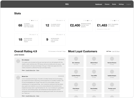
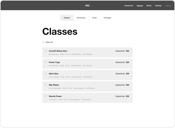
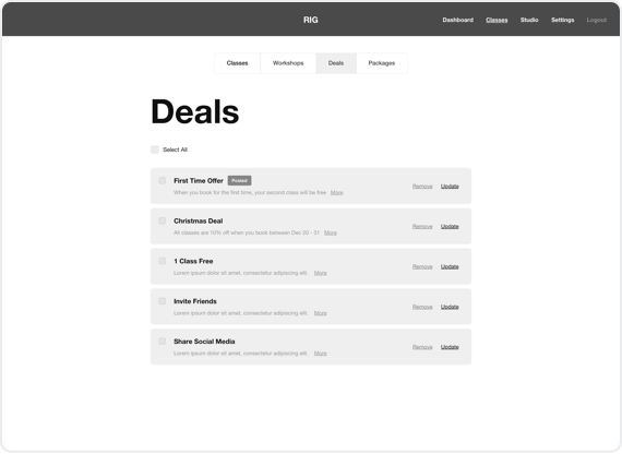
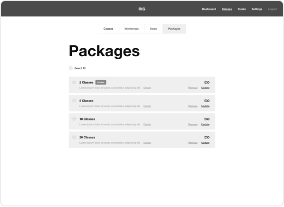
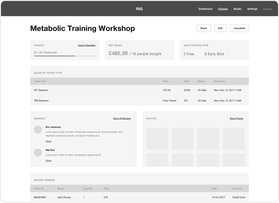
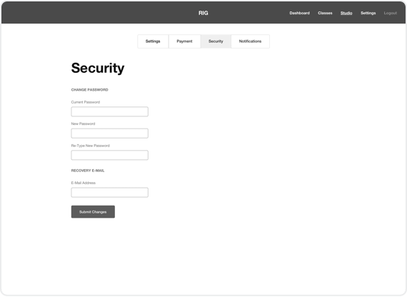
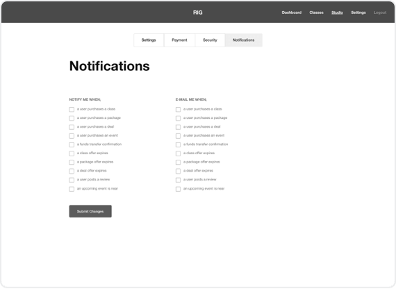
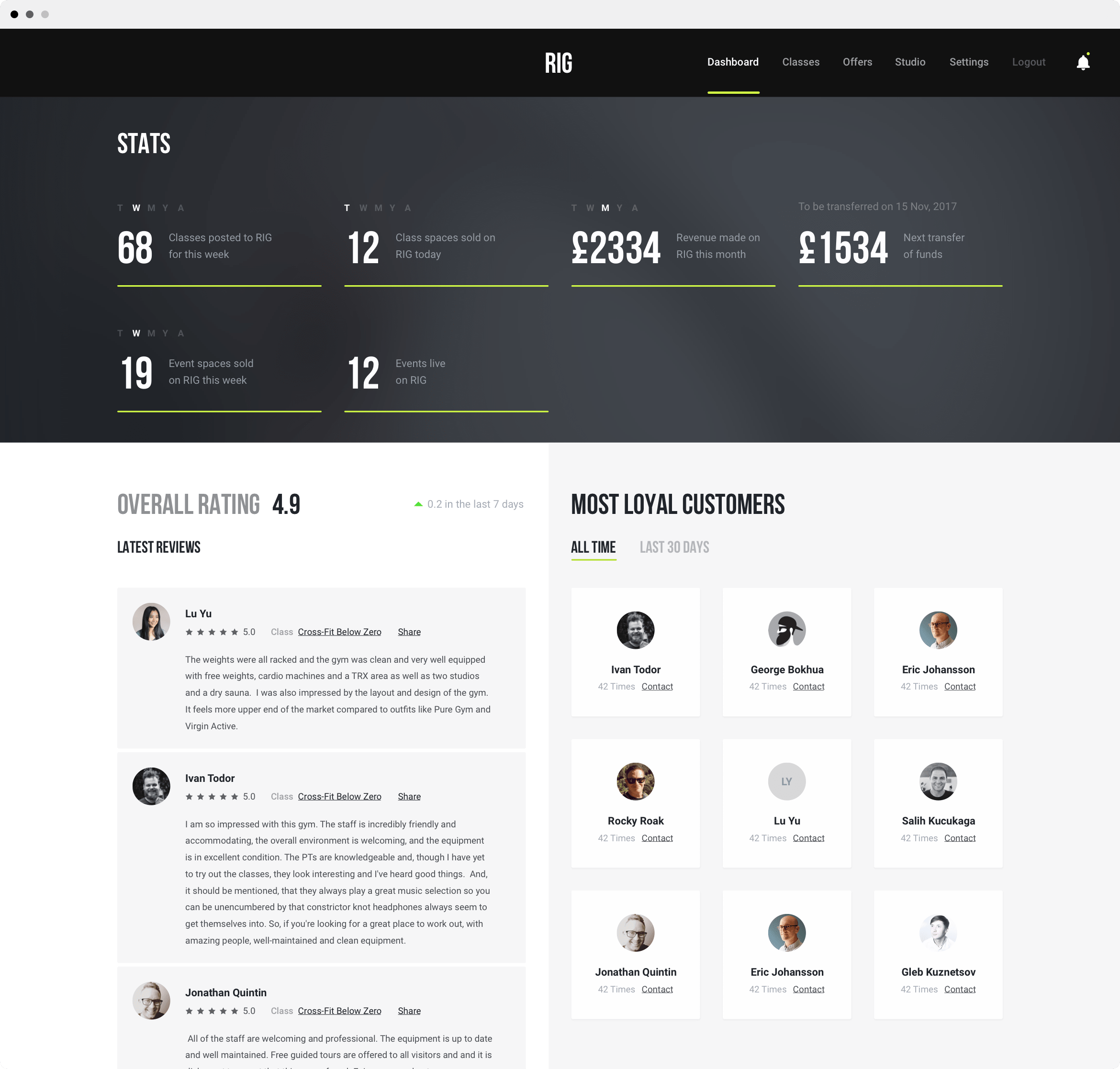
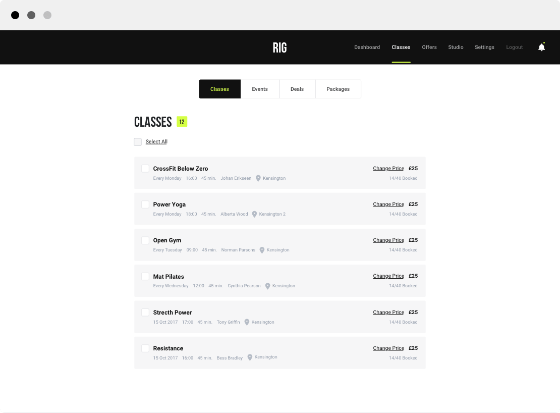
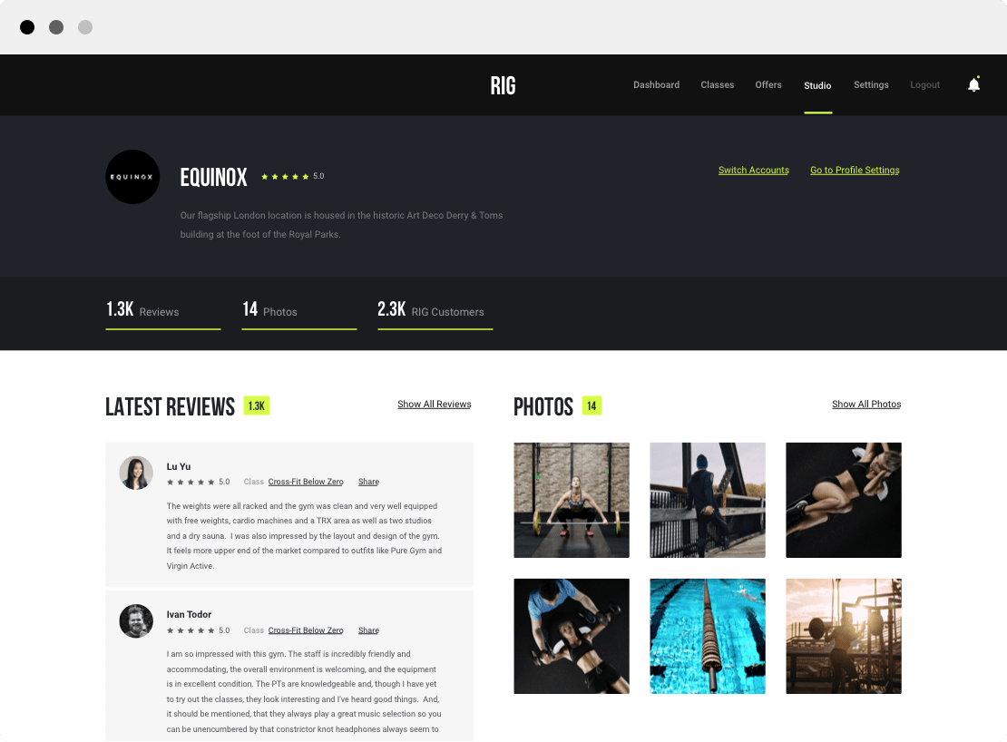
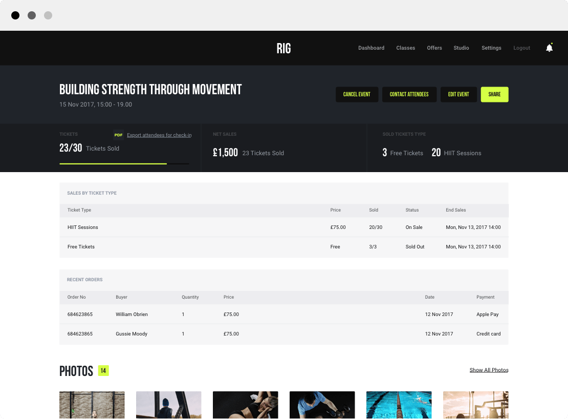
STUDIO DASHBOARD
Apart from the mobile application, we also designed an admin panel for the studios that integrated with MINDBODY, from where they can create classes, keep track of their business in specific time ranges and get to know more about their customer base.
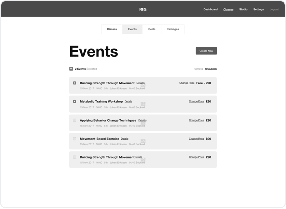
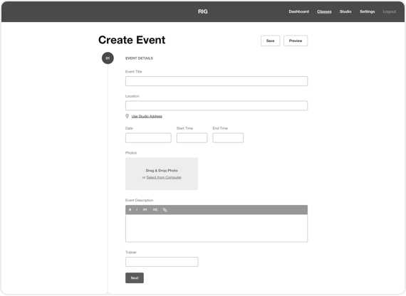
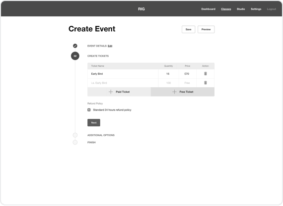
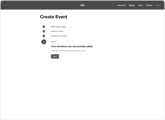
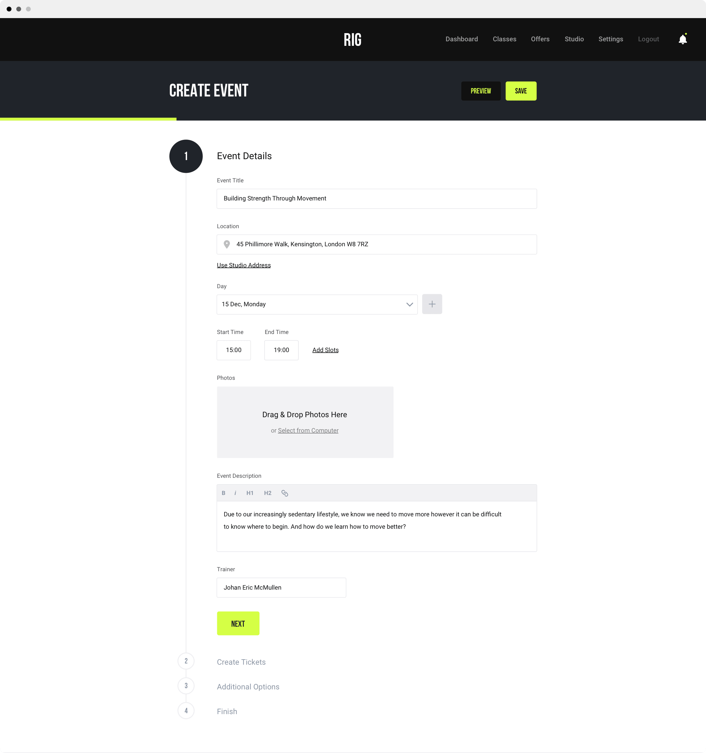
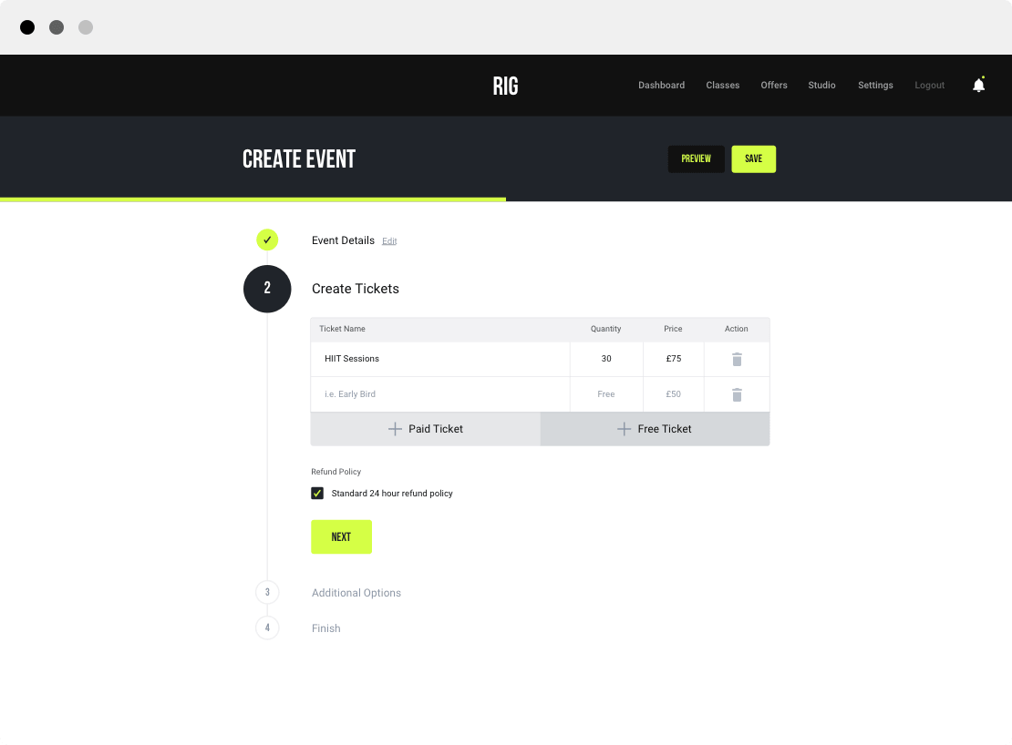
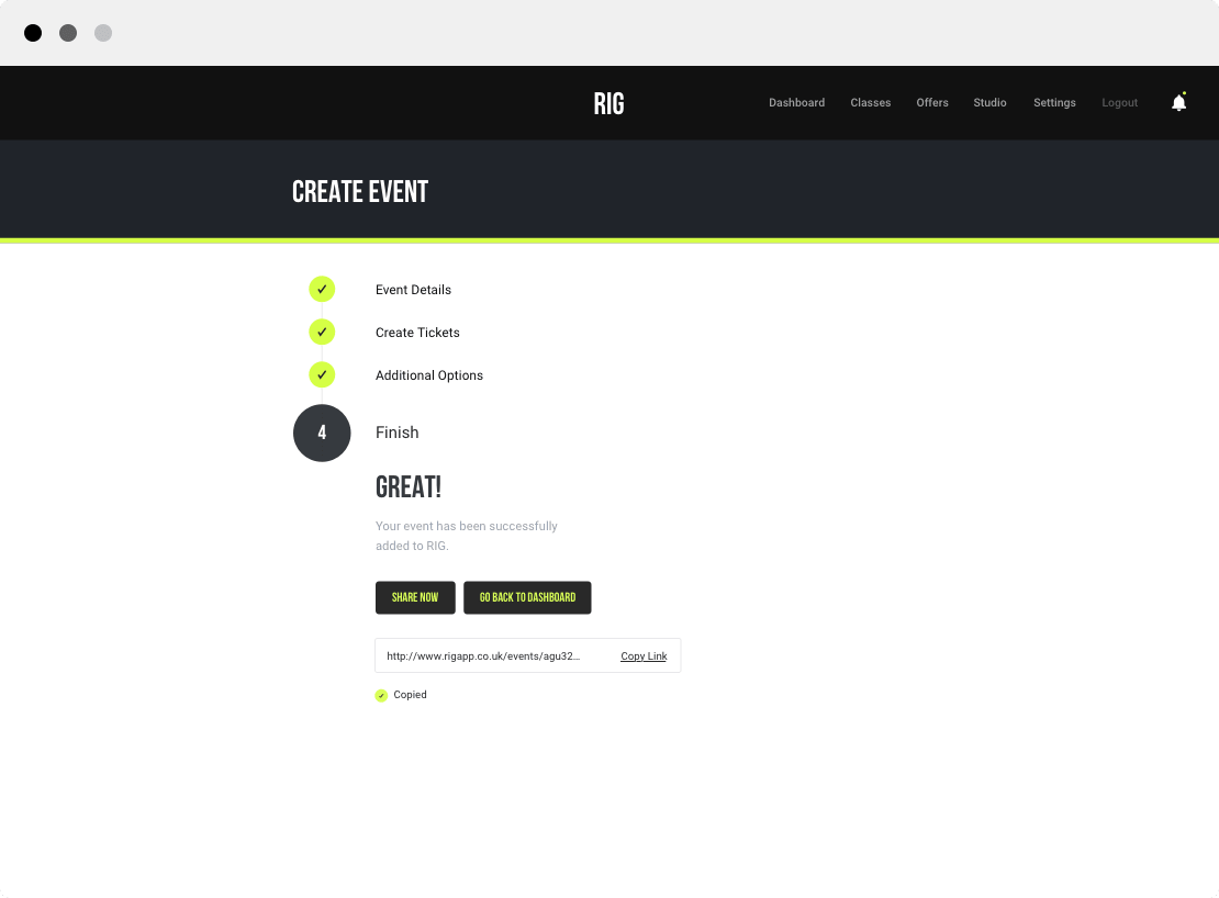
EVENT CREATION
Clearly, the biggest hustle for the gyms would be creating the class they have every day. There could be different constraints for each class like group classes vs personal training sessions, or managing multiple branches under a single account; so we talked to the gym managers and identified them all to come up with a solution that works for all.
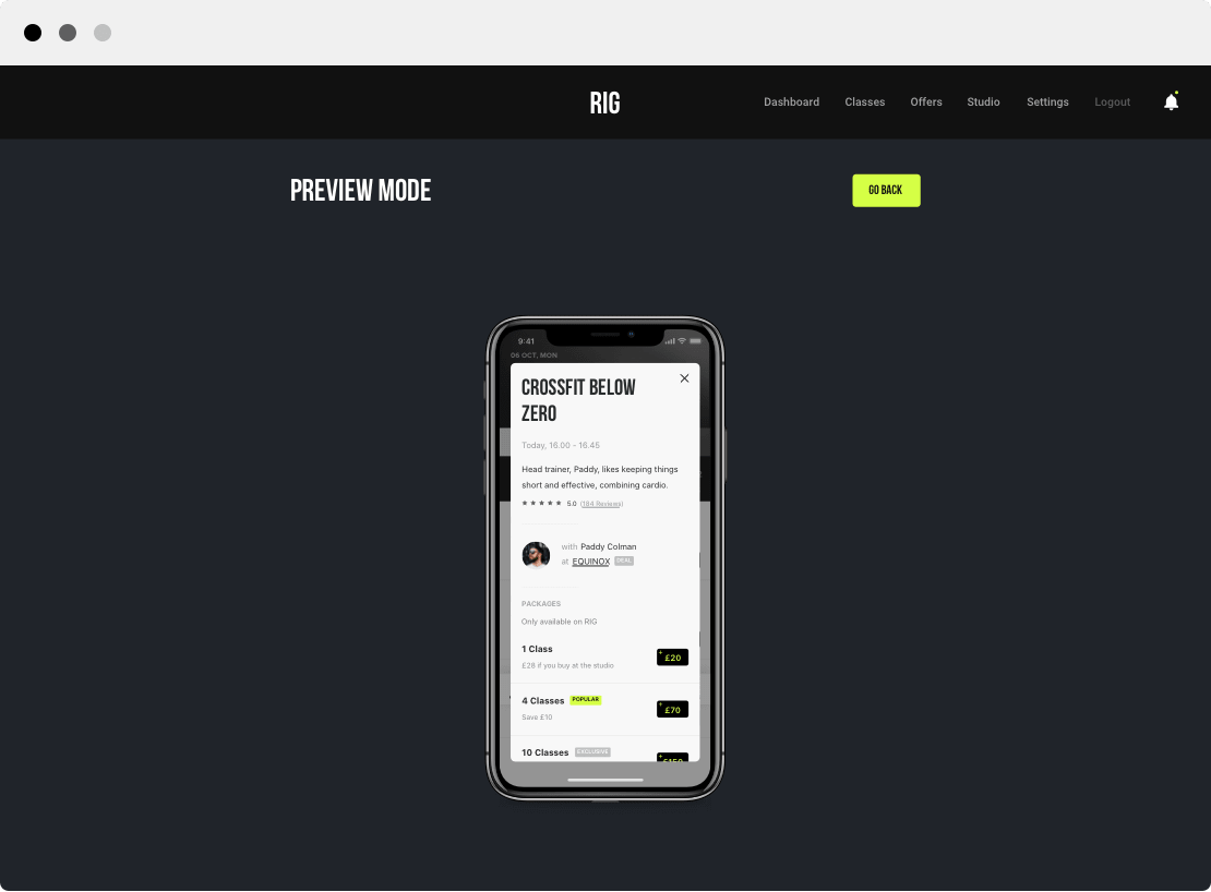
As an example, some studios have the same class at multiple days at a different time, so to make their life easier, we made it possible to choose multiple dates and different times for the same class. We also added a live preview mode without having to leave the page, so they could see how the event would look like in the app.
Did you like what we have done for RIG?
Send us an e-mail for any enquiries and we will contact you within 12 hours.