Churika
You're craving but feeling lazy to leave home and the fridge is empty? There's a new kind of food delivery service in New York.
Services
UX&UI Design, Branding
Type of Work
Responsive Web
Year
2017
WHAT IS CHURIKA?
Having your neighbourhood surrounded by take away shops is one of the best things, but not everyone is that lucky or sometimes 🎶baby it's cold outside. 🎶 Churika is a new platform lets you order from the best take away shops in New York.
DESIGN GUIDELINE
Churika had a young and fun team, so how would we design it to reflect the soul behind it? Even tough eating is one of the best times of the day, deciding what to eat can take way too much time, so we started with creating a visual style using a soft typeface and subtle colours that would take users' attention but also allow photography do its own magic.

Sofia Pro
Sans Serif, Base Font
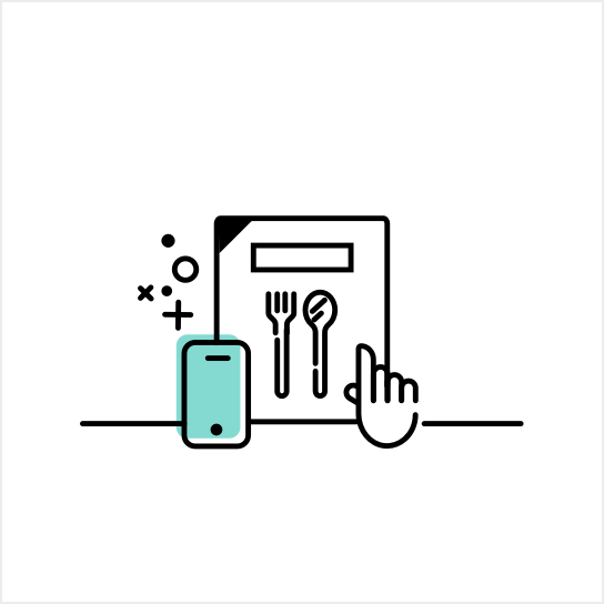
CUSTOM ICONS
We also handcrafted every single icon used across the platform, landing page and marketing materials to build a consistent brand character.
WIREFRAME
Just like all the other projects, after understanding the needs of all user types; we created wireframes and prototypes for each screen in high detail to make sure it everything works as expected.
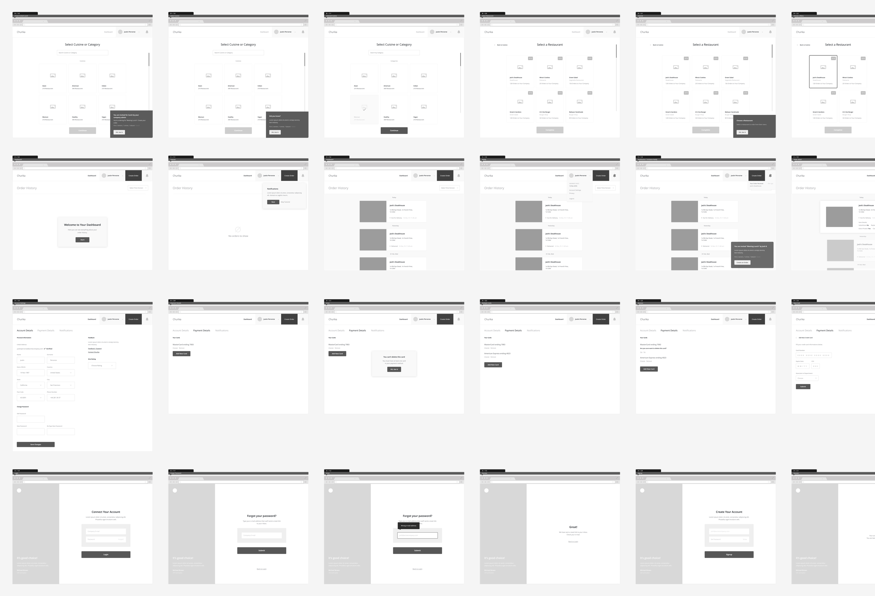
ONBOARDING
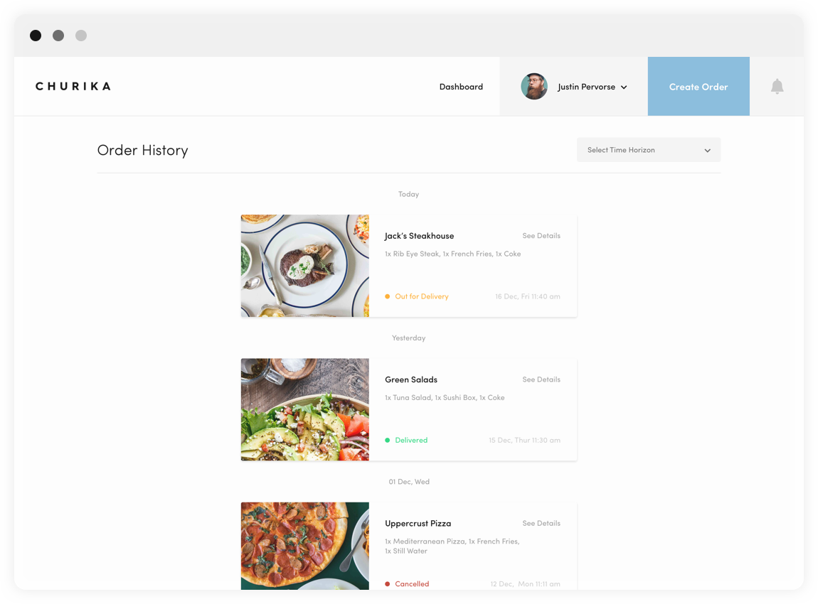
It's often underestimated, but designing the onboarding experience is one of the challenging screens for a product team, so for every project, we test it over and over to make sure we're doing it right for the target user group. Our user study results showed us the conversion rate would increase by 40% if we let users order without creating an account and ask them to do it after the checkout, so they could track their order, see past orders and manage their profile.
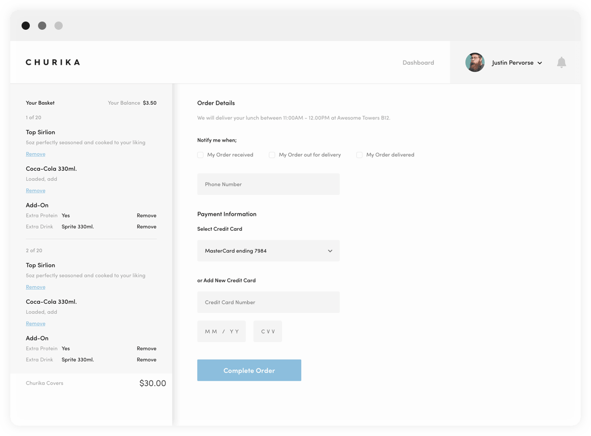
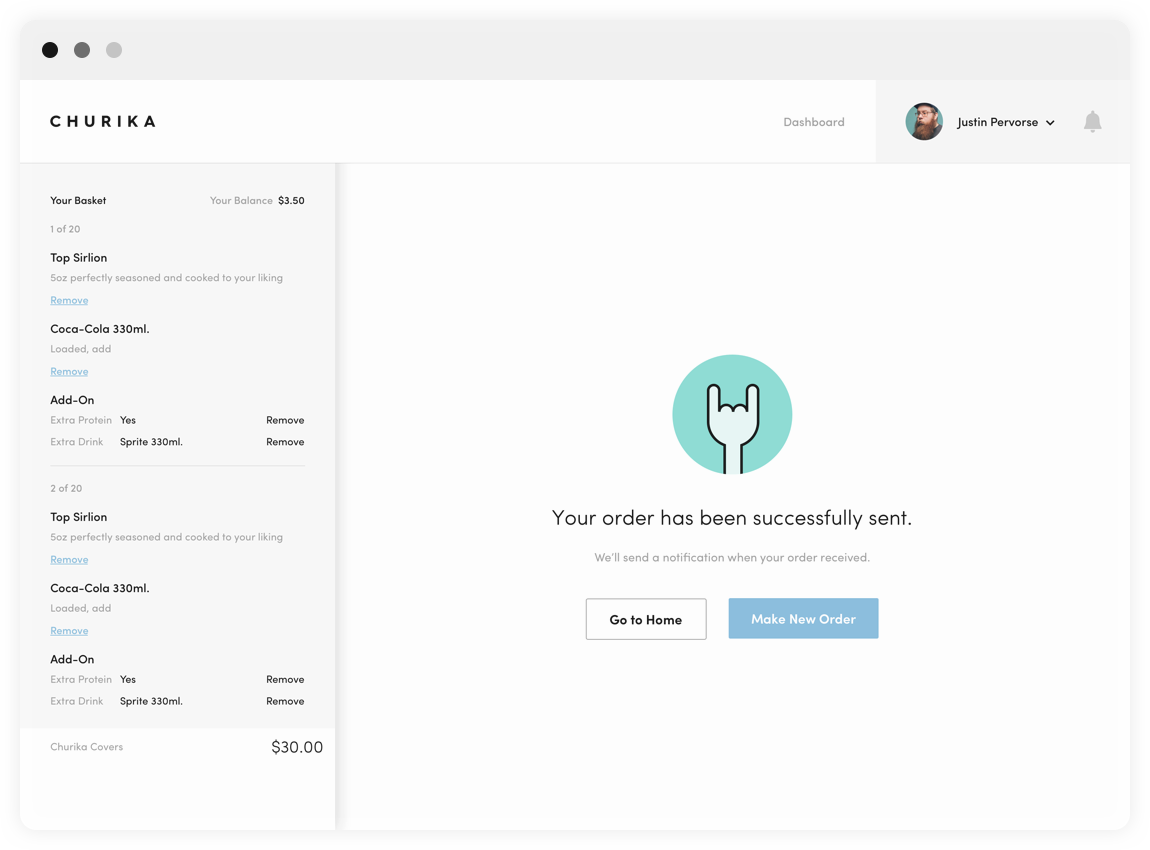
ORDER FUNNEL & CHECKOUT
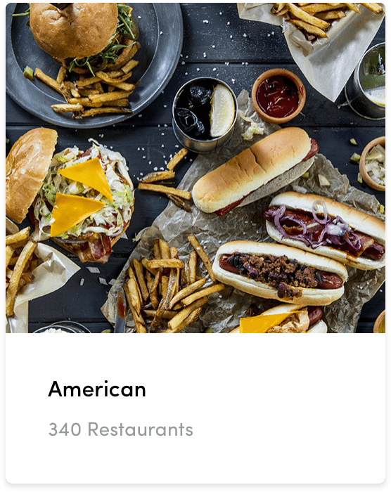
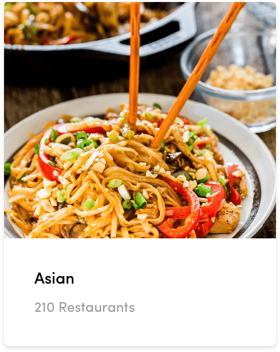
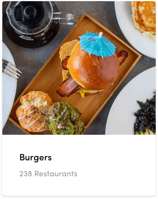
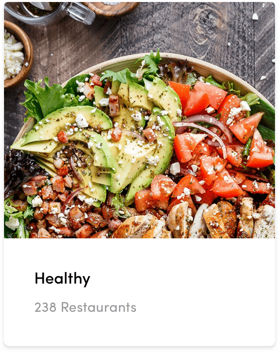
Here is the best part. FOOD. FOOD EVERYWHERE. 🤤
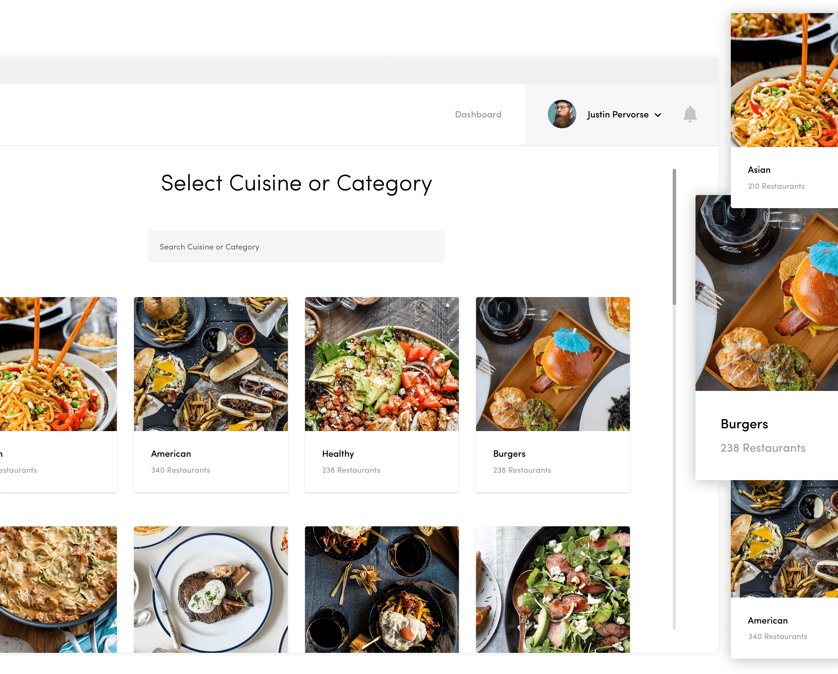
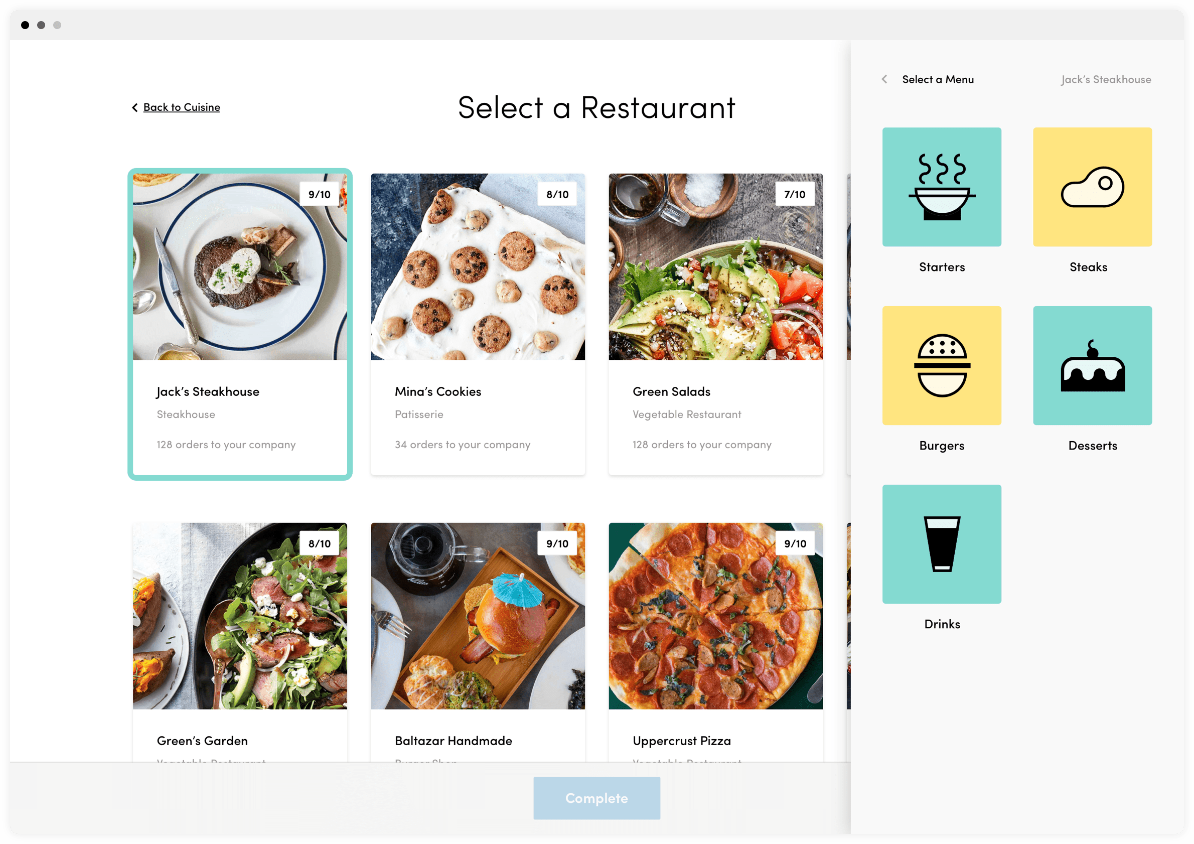
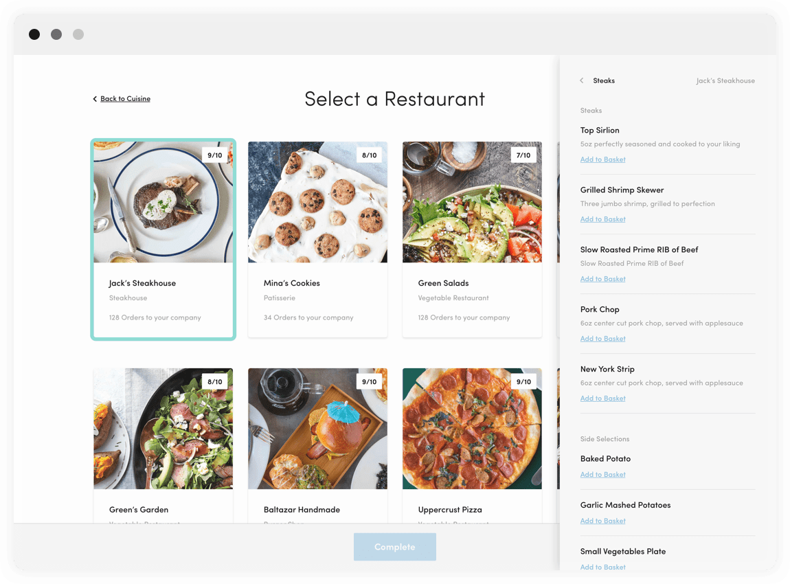
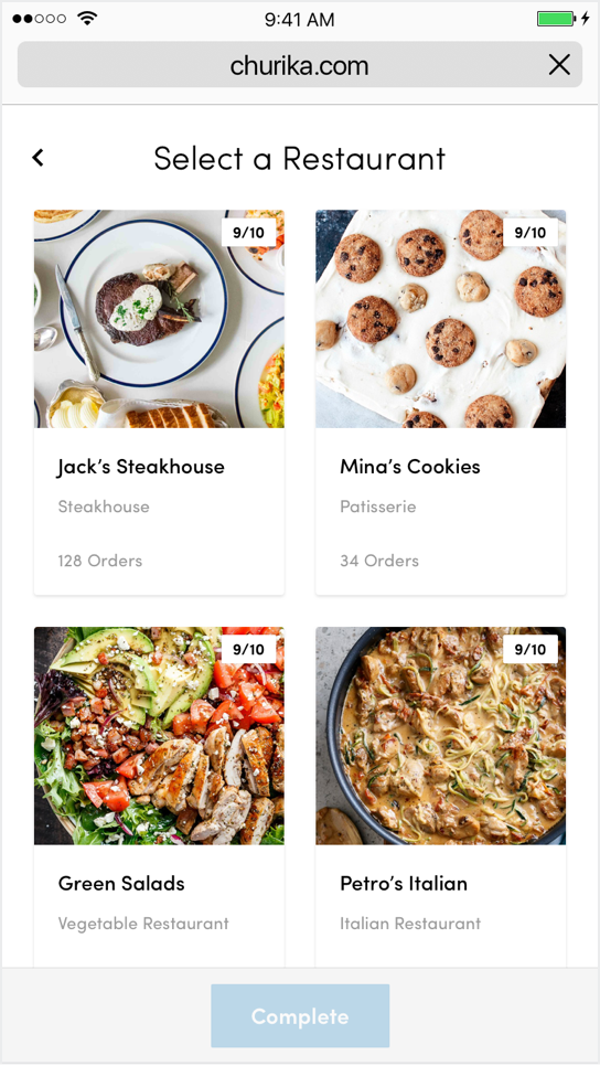
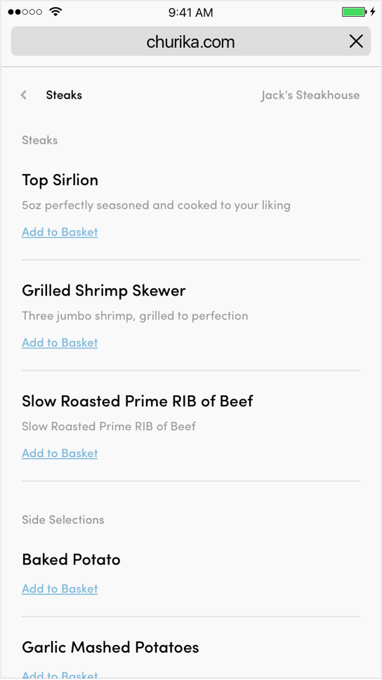
Users start their journey by selecting the type of dish they want and Churika curates them the best restaurants serving to their area. Our research showed us users check 4 restaurants on average before they make their decision, so we let them stay on the same screen to have a quick look at the restaurant menus.
After they know what they want to have, it's just two clicks to view the order summary and complete checkout. ⚡️
MOBILE VIEW
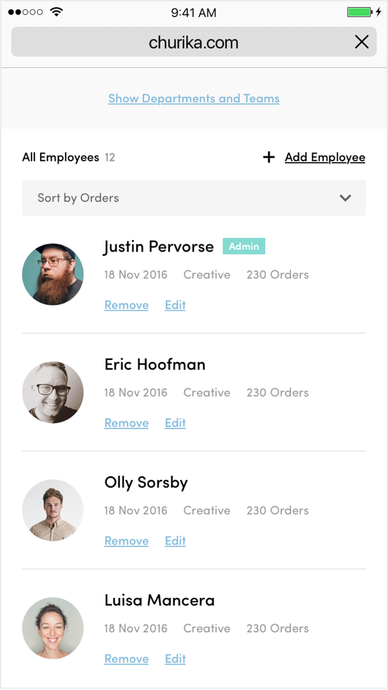
As always, we design websites with the mobile first approach. For every single screen, we made sure it will be an easy experience on to order using different screen sizes in different circumstances.
Did you like what we have done for Frame?
Send us an e-mail for any enquiries and we will contact you within 12 hours.